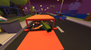
Ok, so we had an awesome time playtesting over the weekend. Bazookas are definitely not the best drive-by weapon, I’ve learned.

Also, I got excellent feed back from our group of testers. Some words of praise are always welcome:
“Your game looks amazing so far”
“It was a crap-ton of fun”
“it looks like it has great potential”
“Well myself and my girlfriend like the game so far!”
But I also asked for constructive criticism, and I was happy to discover some hiccups in the design.
Design Feedback:
1. Font – It is a bit hard to read
2. Confusion at the server menu and how to join
3. Highlighting Real Players vs NPCs
4. Kill messages to show who or what killed you
5. Adding background color in text area when you chat
6. Clarifying Local Chat (T) vs Global chat (Y)
7. Making building “Enterable” icons (lighting) more obvious
8. Binding equipment to keys – It is confusing and hard to use right now
9. Static Map or Minimap showing key locations
10. Cars sometimes flip when exiting
11. Random Fall/Collision damage
12. Rebindable action menu / Mouse buttons for folks who don’t have a 3rd mouse button
I think these were the key takeaways from the alpha test but if you want to share any other ideas, requests, or screenshots, please join and like our FB Page.
Hope to get more testing and feedback done soon
Cheers!
-Benz
